Sanjay Rangavajjhala
Background
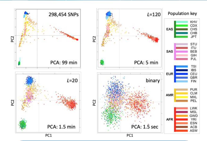
Huge sets of biological data, in the form of electronic health records (EHRs) or genomic data, can take long times to analyze if taken directly from the source. However, in a process known as fingerprinting, these data sets are reduced to numerical vectors which, though lossy informationally, allow for much faster comparison and evaluation times. In the graph to the right, we show genomic data from a Thousand Genomes cohort— the normal comparison is on the top right, with different finger prints with their varying lengths denoted by L shown in the other 3 squares. A change in clarity based on fingerprint size is obvious, but not necessarily quantifiable.
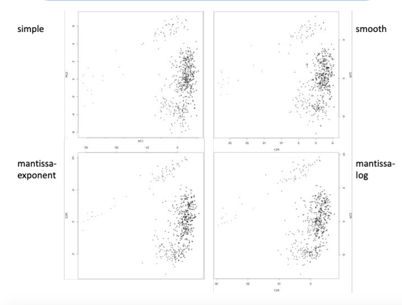
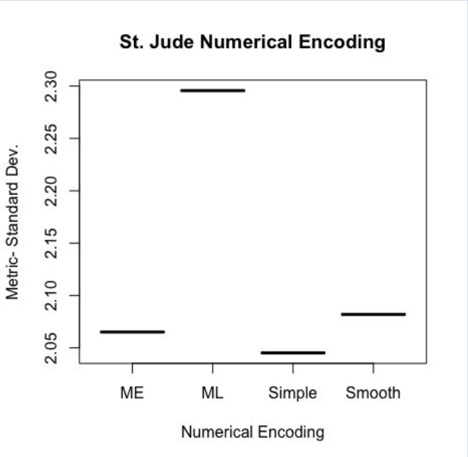
This raises an issue when looking at something like the graph to the left— the internal structure of the data is up for interpretation, and it is hard to tell which one seems more “clumpy”, or separated into distinct groups. My project aimed to create a way to quantify this so that fingerprints could be fine-tuned to be the most accurate at showing datasets’ internal structure efficiently. The graph to the left explores different numerical encoding methods as applied to a cohort of 500 childhood cancer survivors from St. Jude hospital.
Metric Analysis
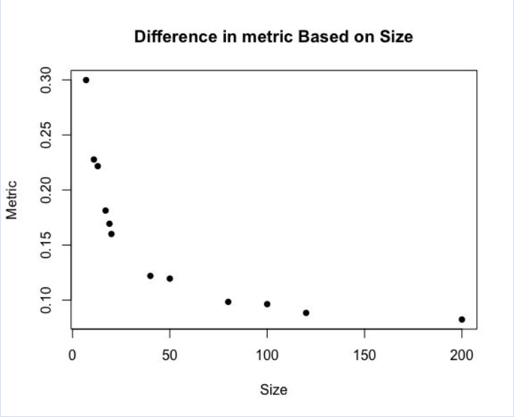
Instead of using a clustering algorithm to judge internal structure, which is very computationally intensive and hard to perform repeatedly, we used pairwise distances. For each individual, we measured the Euclidean distances to every other individual, creating a table of N*(N-1)/2 values (given that there are N individuals). Taking a metric from that— we used standard deviation, though in the future we believe a more nuanced metric may help for more accurate judging— identifies how the data is spread. Below, you can see that as the fingerprint size increases, the standard deviation goes down, which is to be expected based on the first graph.
Results
Surprisingly, however, we found a sharp elbow in the relationship between clarity and size. As shown above, after around fingerprint size 40, there is a leveling off in how much the clarity increases based on the size. This is significant because we would theoretically want to have the best “bang for our buck” in terms of time vs clarity.
Expanding Further
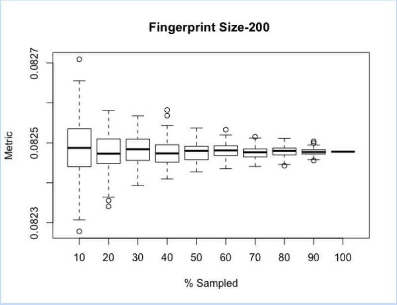
An N^2 algorithm may be fine for small data sets, but the moment you go to larger ones it becomes too computationally heavy. Thus, instead of doing every comparison, you could do a random percent of the total comparisons to maintain the same patterns of standard deviation without running the entire set of samples. To explore how much of the total pairwise distances should be sampled, we sampled each percent from 10-100% at increments of 10 100 times and plotted the box plots below. As you can see, the range, standard deviation, and medians all converge on a singular point which is the singular value at 100% sampled. This could be used in setting a specified range beforehand for what the range of the metric could be, thereby dictating what percent of the data is sampled.
To wrap my project up, I decided to revisit the graph that fueled my project to begin with: the numerical encoding structural differences were hardly discernible to the naked eye. However, after running a full pairwise comparison on each of the 4 numerical encoding methods, I found that the simple encoding method yielded the marginally best results. However, there is always a chance that standard deviation may not be the best metric to measure the dataset— this is also something I would like to explore in the future. A graph of the metric versus numerical encoding methods is shown below.
Acknowledgments
This project could not have been possible without the supportive mentorship of Dr. Gustavo Glusman, the constant support from the other high school interns, and the opportunity from the ISB.